T-mobile, Salesforce
T-Mobile Salesforce Experience Optimization
Project Overview
While working at T-Mobile, I partnered closely with product and engineering teams to identify opportunities for improving the Salesforce user experience used by internal sales teams. The goal was to create a more intuitive, efficient, and scalable experience while aligning the platform more closely with Salesforce Lightning Design System standards and interaction design best practices.
This initiative also served as an early step toward establishing a unified T-Mobile and Salesforce design system that could provide consistency across future internal tools and workflows.
Challenge
The existing Salesforce experience contained visual inconsistencies, unclear interaction patterns, and usability issues that created friction for users completing sales and customer management tasks. While the platform was functional, opportunities existed to improve readability, accessibility, error prevention, and overall user efficiency without disrupting existing workflows.
A key challenge was balancing T-Mobile's brand identity with Salesforce's established design conventions. Excessive use of brand colors in functional interfaces risks competing with visual cues that users rely on to understand status, hierarchy, and system feedback.
Approach
To better understand the platform and identify improvement opportunities, I conducted an in-depth review of Salesforce Lightning Design System guidelines and evaluated existing user journeys against industry-standard UX principles.
My work focused on:
Auditing existing Salesforce screens for visual and interaction inconsistencies
Aligning UI patterns with Salesforce Lightning Design System standards
Creating mockups and prototypes that improved clarity and usability
Establishing recommendations for a scalable T-Mobile Salesforce design framework
Collaborating with engineering to assess implementation feasibility
Design Improvements
Visual Hierarchy & System Consistency
I redesigned key interface elements to improve readability, reduce cognitive load, and create a stronger visual hierarchy. This included refining typography, spacing, component usage, and color application.
Strategic Use of Color
I proposed a more intentional use of T-Mobile brand colors within the interface. Rather than using brand colors for primary system interactions, I recommended preserving established UI color conventions for actions, alerts, warnings, and status indicators to improve usability and user recognition.
Form Validation & Error Prevention
I identified opportunities to improve form completion and reduce user frustration by introducing:
Real-time validation and feedback
Clearer error messaging
Visibility of required fields above the fold
Immediate guidance for formatting requirements before form submission
For example, users would receive instant feedback such as "Phone number must contain 9 digits" rather than discovering errors only after submitting a form.
Outcome
The project established a foundation for improving Salesforce usability across T-Mobile's internal tools while creating a framework for future design system standardization. The recommendations helped drive conversations around consistency, accessibility, and scalable design practices, supporting a more efficient and user-centered experience for internal sales teams.
This version reads more like a senior product designer case study and highlights systems thinking, UX strategy, design rationale, and collaboration with engineering.
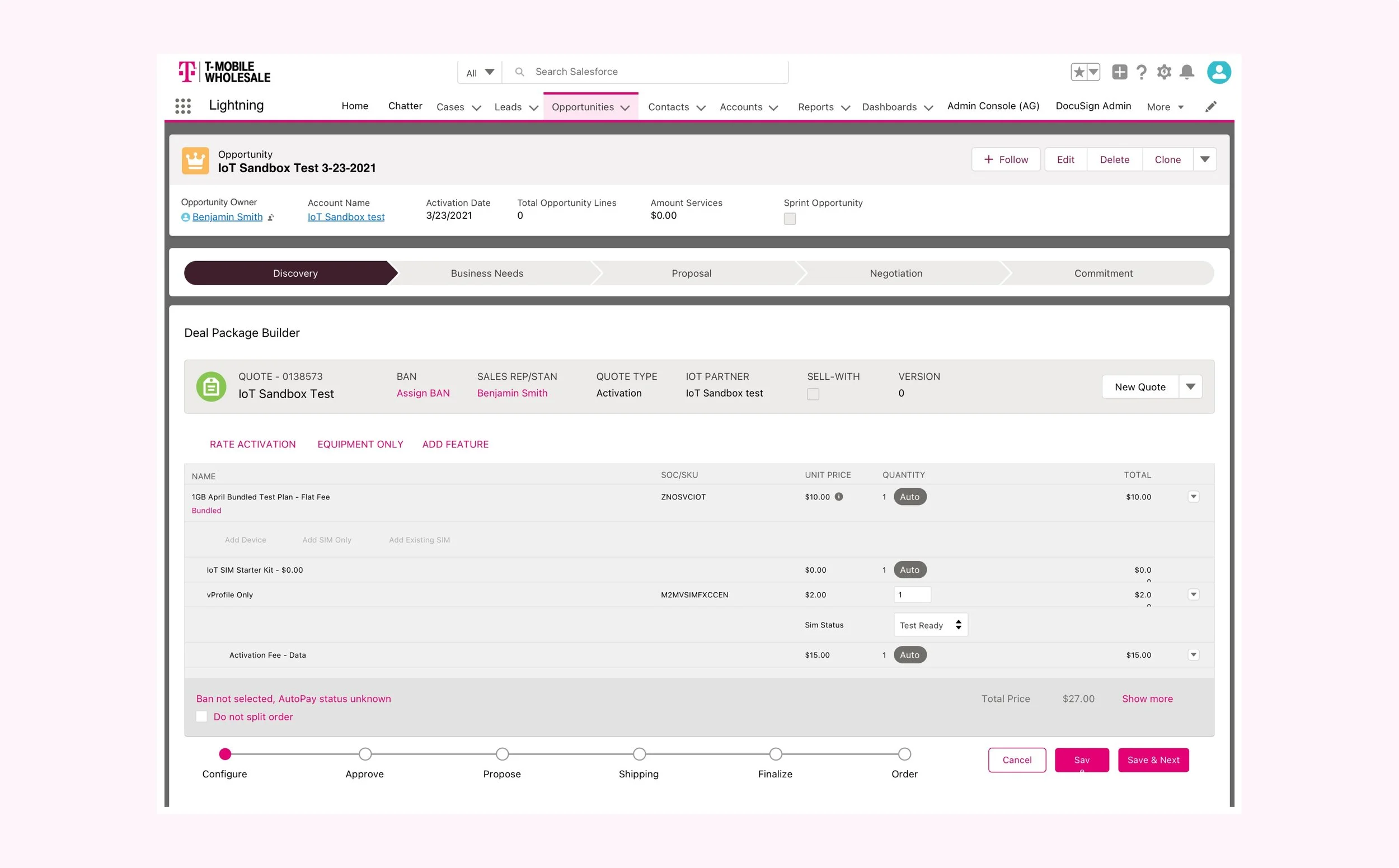
Project
SFDC IoT-UI Bundled Plans in DPB
One of the several projects shown below was to improve the SFDC IoT-UI Bundled Plans in DPB user experience. I am not able to show more screens in detail.